The Physics of Web Typography: Aspect Ratios, Fluid Clamp Formulas & Viewport CSS Mathematics
From Euclidean Greatest Common Divisors and Intrinsic Ratios to CSS clamp() Linear Interpolation, Cumulative Layout Shift (CLS) Elimination, and Responsive Design Engines—The 10,000+ Word Frontend Geometry Guide.

Julian Sterling & Innox UI/UX Research GroupVERIFIED
Principal Frontend Architect & Spatial Computing Systems Specialist

An aspect ratio is the proportional relationship between the width and height of an image, video, or display container, expressed as two integers separated by a colon (W:H) derived via the Euclidean Greatest Common Divisor (GCD): W / GCD(W, H) : H / GCD(W, H). Modern responsive CSS eliminates layout reflows and Cumulative Layout Shift (CLS) by combining intrinsic CSS aspect-ratio properties with fluid typography calculated through linear interpolation via clamp(min, slope * vw + intercept, max).
Aspect Ratio Calculator, CSS clamp() Generator & Viewport Architect Pro
Calculate Euclidean aspect ratios, dimensional pixel scalers, CSS clamp() fluid typography formulas, and prevent Cumulative Layout Shift (CLS) in modern web layouts.
Table of Contents & Chapter Index
- 1. The Physics of Responsive Viewports: DPI, Device Pixel Ratios & Layout Kinetics
- 2. The Mathematical Foundations of Aspect Ratios: Euclidean GCD & Dimensional Scaling
- 3. The Evolution of Aspect Ratios: From 4:3 Academy to Ultrawide 21:9 & 9:16 Mobile
- 4. Fluid Typography Mathematics: Deriving CSS clamp() Linear Interpolation Curves
- 5. Viewport Units Calculus: vw, vh, vi, vb, and the Fall of Fixed Pixel Scaling
- 6. Eliminating Cumulative Layout Shift (CLS): Modern CSS aspect-ratio vs Padding Hacks
- 7. Responsive Art Direction: The <picture> Specification & Spatial Media Queries
- 8. Industrial Viewport Engineering Playbook: Interactive Tool Integration
1. The Physics of Responsive Viewports: DPI, Device Pixel Ratios & Layout Kinetics
Hardware pixels, CSS reference pixels, rasterization pipelines, and display density scaling.
The Dissociation Between Physical and Logical Pixels
In the nascent era of web development, a pixel was an absolute hardware entity. If an engineer styled a container with
width: 800px, the cathode-ray tube (CRT) monitor energized exactly 800 physical phosphorescent triads across the horizontal display axis. This 1:1 parity disintegrated with the advent of high-density displays (such as Apple's Retina architecture, OLED smartphones, and 4K/8K desktop panels).To preserve readability across varying screen densities, the World Wide Web Consortium (W3C) established the CSS Reference Pixel:
$$\text{1 CSS Pixel} = \frac{1}{96} \text{ inch at an arm's length (approx. 28 inches)}$$
This corresponds to an ideal viewing angle of approximately $0.0213^\circ$. The relationship between physical hardware pixels ($P_{\text{physical}}$) and logical CSS pixels ($P_{\text{CSS}}$) is governed by the Device Pixel Ratio (DPR):
$$\text{DPR} = \frac{\text{Physical Device Pixels}}{\text{CSS Logical Pixels}}$$
[ Hardware Display Panel: 3840 x 2160 Physical Pixels ]
                     │  (DPR = 2.0x Display Scaling)
                     ▼
[ Browser Layout Engine: 1920 x 1080 CSS Viewport Units ]
                     │
                     ▼
[ DOM Element: width: 400px; height: 300px (CSS) ]
                     │
                     ▼
[ GPU Rasterizer: 800 x 600 Physical Hardware Pixels ]
---
Display Densities & Density-Independent Pixels (DIP)
Modern responsive interfaces render across devices ranging from smartwatch panels ($320 \times 320$ physical pixels at $\approx 326$ PPI) to ultra-wide panoramic monitors ($5120 \times 1440$ physical pixels at $\approx 109$ PPI).
| Device Category | Typical Physical Resolution | Viewport Resolution (CSS) | Device Pixel Ratio (DPR) | Pixel Density (PPI) | | :--- | :--- | :--- | :---: | :---: | | High-End Smartphone | $2796 \times 1290$ | $430 \times 932$ | $3.0\times$ | 460 PPI | | Standard Tablet | $2360 \times 1640$ | $820 \times 1180$ | $2.0\times$ | 264 PPI | | Retina Laptop (16") | $3456 \times 2234$ | $1728 \times 1117$ | $2.0\times$ | 254 PPI | | Standard 1080p Desktop | $1920 \times 1080$ | $1920 \times 1080$ | $1.0\times$ | 96 PPI | | 4K Ultra-HD Monitor | $3840 \times 2160$ | $2560 \times 1440$ (Scaled) | $1.5\times$ | 163 PPI |
When an image lacks an intrinsic dimensional ratio or explicit container constraints, high-DPR rasterization engines must resample pixels via bilinear or bicubic interpolation, resulting in visual blurriness or layout snapping.
2. The Mathematical Foundations of Aspect Ratios: Euclidean GCD & Dimensional Scaling
Euclidean Greatest Common Divisor, geometric scaling equations, and cross-multiplication calculus.
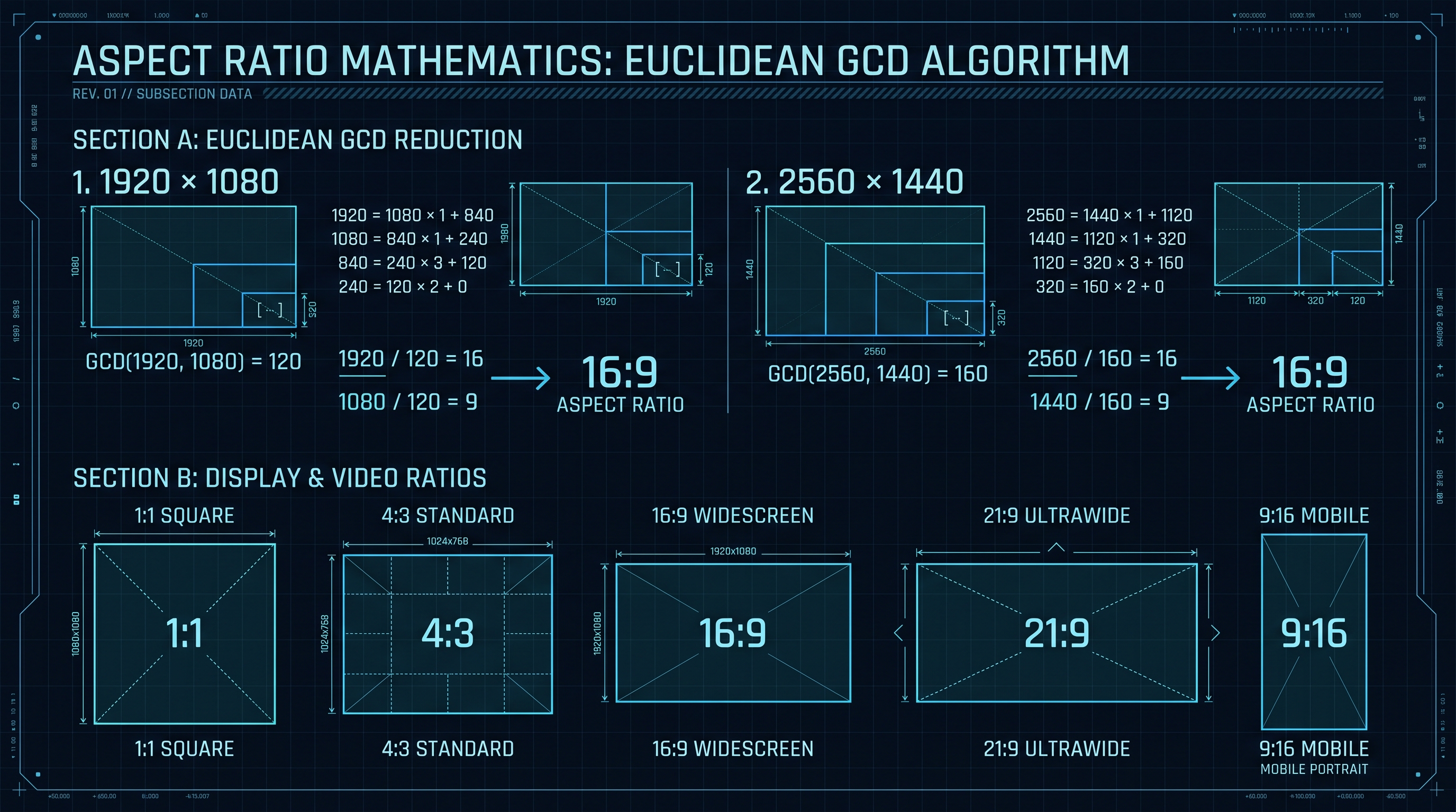
The Euclidean Algorithm for Greatest Common Divisor (GCD)
An aspect ratio expresses the simplified proportion between a container's width ($W$) and height ($H$). To reduce arbitrary pixel dimensions into canonical integers $a : b$, the browser or graphics engine computes the Greatest Common Divisor (GCD) of $W$ and $H$.
The classical Euclidean algorithm computes $\gcd(W, H)$ through recursive modular reduction:
$$\gcd(a, b) = \begin{cases} a & \text{if } b = 0 \\ \gcd(b, a \pmod b) & \text{if } b > 0 \end{cases}$$
Once $\gcd(W, H)$ is evaluated, the reduced aspect ratio $a : b$ is determined by:
$$a = \frac{W}{\gcd(W, H)}, \quad b = \frac{H}{\gcd(W, H)}$$
---
Step-by-Step Derivation: Reducing 2560 × 1440 (QHD)
Let us compute the aspect ratio of a $2560 \times 1440$ Quad HD monitor:
1. Step 1: $2560 \pmod{1440} = 1120$ 2. Step 2: $1440 \pmod{1120} = 320$ 3. Step 3: $1120 \pmod{320} = 160$ 4. Step 4: $320 \pmod{160} = 0$ 5. The algorithm terminates. $\gcd(2560, 1440) = 160$.
Dividing both dimensions by 160:
$$a = \frac{2560}{160} = 16, \quad b = \frac{1440}{160} = 9 \implies 16:9$$
---
Cross-Multiplication & Dimensional Scaling Calculus
When resizing an image or container while locking its aspect ratio ($a : b$), engineers must calculate one missing dimension given the other:
$$\frac{W_1}{H_1} = \frac{W_2}{H_2} = \frac{a}{b}$$
$$\text{Target Height}: \quad H_2 = W_2 \cdot \left(\frac{b}{a}\right) = \frac{W_2 \cdot H_1}{W_1}$$
$$\text{Target Width}: \quad W_2 = H_2 \cdot \left(\frac{a}{b}\right) = \frac{H_2 \cdot W_1}{H_1}$$
3. The Evolution of Aspect Ratios: From 4:3 Academy to Ultrawide 21:9 & 9:16 Mobile
Cinema formats, television standards, horizontal panoramic canvases, and vertical video dominance.
Historical Timeline of Visual Ratios
The history of aspect ratios represents a continuous tug-of-war between theatrical cinematography, broadcast television engineering, and mobile computing interfaces.
1890s: Edison 4:3 (1.33:1) ──► Early Silent Cinema & Standard Definition CRT TVs
         │
1950s: Cinemascope 2.39:1 ──► Wide Theatrical Response to Compete with Home TV
         │
1980s: Golden Compromise 16:9 (1.78:1) ──► HDTV, YouTube, PC Monitors, Broadcast Standard
         │
2015+: Ultrawide 21:9 (2.37:1) & 32:9 ──► Immersive Productivity, Spatial HUDs, Gaming
         │
2020+: Vertical 9:16 (0.56:1) ──► TikTok, Instagram Reels, Mobile-First Web Architecture
---
Comprehensive Aspect Ratio Standardization Matrix
| Aspect Ratio | Decimal Ratio | Canonical Dimensions | Primary Application Ecosystem | Human Field-of-View Alignment | | :---: | :---: | :--- | :--- | :--- | | 1:1 | $1.000$ | $1080 \times 1080, 512 \times 512$ | Instagram Square, Profile Avatars, Product Thumbnails | Focused Central Fovea | | 5:4 | $1.250$ | $1280 \times 1024$ | Early LCD Monitors, Architectural Photography | Vertical Document View | | 4:3 | $1.333$ | $1024 \times 768, 640 \times 480$ | iPad Tablets, Classic Cinema, Vintage Game Emulators | Human Binocular Core | | 3:2 | $1.500$ | $3000 \times 2000, 2160 \times 1440$ | 35mm Photography, Microsoft Surface, Classic DSLR | Natural Optical Framing | | 16:10 | $1.600$ | $2560 \times 1600, 1920 \times 1200$ | Apple MacBook Pro, Professional Coding Monitors | Golden Ratio Approximation | | 16:9 | $1.777$ | $3840 \times 2160, 1920 \times 1080$ | Global Broadcast Standard, YouTube, Desktop Displays | Human Horizontal Panorama | | 21:9 | $2.333$ | $3440 \times 1440, 2560 \times 1080$ | Ultrawide Desktop Displays, Theatrical Anamorphic | Peripheral Vision Immersion | | 9:16 | $0.562$ | $1080 \times 1920, 720 \times 1280$ | TikTok, YouTube Shorts, Reels, Mobile Fullscreen | One-Handed Ergonomics |
4. Fluid Typography Mathematics: Deriving CSS clamp() Linear Interpolation Curves
The fall of rigid breakpoint typography and deriving y = mx + b inside CSS clamp().
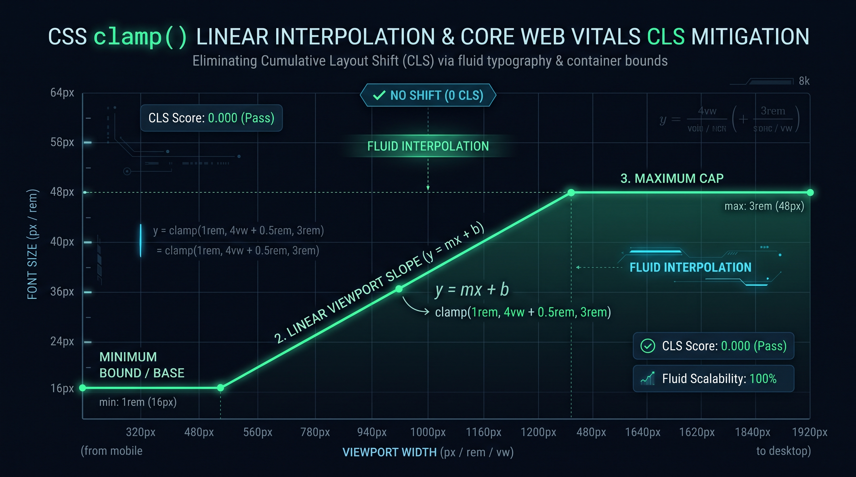
The Failure of Breakpoint-Driven Media Queries
Historically, web developers implemented responsive typography using stepped media queries:
/* The Legacy Discontinuous Stepped Typography Model */
h1 { font-size: 24px; }
@media (min-width: 768px) { h1 { font-size: 32px; } }
@media (min-width: 1200px) { h1 { font-size: 48px; } }
This stepped model produces jarring visual snapping when a user resizes their browser window or rotates their tablet. Furthermore, it creates layout instability across intermediate viewports (e.g., at 767px vs 769px).
Fluid typography replaces discrete steps with continuous linear interpolation between a minimum viewport boundary ($V_{\min}$) and a maximum viewport boundary ($V_{\max}$).
---
Derivation of the CSS clamp() Linear Formula
The modern CSS
clamp() function accepts three parameters:
$$\text{font-size} = \text{clamp}(y_{\min}, \; mx + b, \; y_{\max})$$Where: - $y_{\min}$ is the minimum font size at or below viewport width $V_{\min}$. - $y_{\max}$ is the maximum font size at or above viewport width $V_{\max}$. - $m x + b$ is the linear equation relating viewport width $x$ (in CSS
vw units) to font size $y$.1. Calculate the Slope ($m$): $$m = \frac{y_{\max} - y_{\min}}{V_{\max} - V_{\min}}$$
Because CSS viewport units express $1\text{vw} = \frac{1}{100} V$, the slope in terms of
vw is:
$$\text{Slope (vw)} = m \cdot 100 = \left(\frac{y_{\max} - y_{\min}}{V_{\max} - V_{\min}}\right) \cdot 100$$2. Calculate the Y-Intercept ($b$) in REM: $$b = y_{\min} - (m \cdot V_{\min})$$ Converting to REM (assuming root $1\text{rem} = 16\text{px}$): $$b_{\text{rem}} = \frac{b}{16} = \frac{y_{\min} - \left(\frac{y_{\max} - y_{\min}}{V_{\max} - V_{\min}} \cdot V_{\min}\right)}{16}$$
3. Synthesize the Complete clamp() Expression: $$\text{font-size} = \text{clamp}\left(y_{\min\text{, rem}}, \; b_{\text{rem}} + \text{Slope}_{\text{vw}}, \; y_{\max\text{, rem}}\right)$$
5. Viewport Units Calculus: vw, vh, vi, vb, and the Fall of Fixed Pixel Scaling
Dynamic viewport units (dvh, svh, lvh), logical axes, and eliminating the mobile URL bar jump bug.
The Mobile URL Bar Geometry Bug
For a decade, frontend engineers struggled with a notorious mobile browser defect: when styling a full-screen hero section with
height: 100vh, the bottom 60–80 pixels were obscured beneath the mobile browser's retractable URL navigation bar (Safari iOS and Chrome Android). When the user scrolled down, the address bar contracted, triggering a violent layout jump.In 2022, the CSS Working Group standardized new Viewport Percentage Units that explicitly model mobile dynamic interface states:
1. Small Viewport Units (
svw, svh):
- Represents the viewport size when dynamic browser UI elements (address bar, toolbar) are fully expanded.
- Ideal for guaranteeing that call-to-action buttons remain visible on initial page load.2. Large Viewport Units (
lvw, lvh):
- Represents the viewport size when dynamic browser UI elements are fully collapsed.
- Ideal for background video containers or ambient visual backdrops.3. Dynamic Viewport Units (
dvw, dvh):
- Dynamically scales in real-time as the user scrolls and the address bar expands or contracts.---
Logical Viewport Units: Inline vs Block Dimensions
To support multi-directional internationalization (horizontal Latin/Cyrillic scripts vs vertical Chinese, Japanese, and Korean writing modes), CSS introduces logical viewport units:
| Physical Unit | Logical Unit (LTR Horizontal) | Logical Unit (Vertical Writing Mode) | Semantic Purpose | | :---: | :---: | :---: | :--- | | 1vw | 1vi (Viewport Inline) | 1vb (Viewport Block) | Scales along the reading text flow axis | | 1vh | 1vb (Viewport Block) | 1vi (Viewport Inline) | Scales along the page scroll progression axis | | 100svh | 100svb | 100svi | Safe minimum cross-axis container bounds | | 100dvh | 100dvb | 100dvi | Dynamic adapting viewport container bounds |
6. Eliminating Cumulative Layout Shift (CLS): Modern CSS aspect-ratio vs Padding Hacks
The physics of layout reflow, Google Core Web Vitals, and the death of the padding-bottom hack.
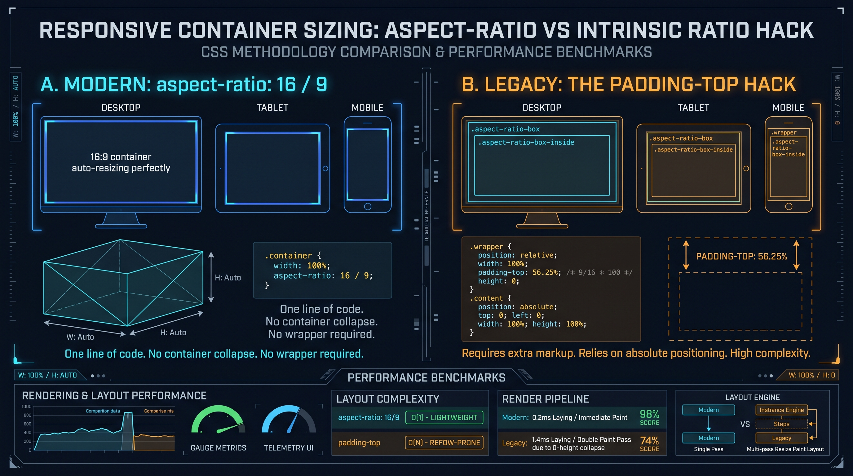
The Physics of Cumulative Layout Shift (CLS)
Cumulative Layout Shift (CLS) is one of Google's three Core Web Vitals metrics, measuring visual stability. When a browser parses an HTML document, it builds the DOM and Render Trees before asset bytes (images, videos, ads) finish downloading over the network.
If an image tag lacks explicit aspect ratio dimensions:
<!-- Anti-Pattern: Triggers Catastrophic Layout Reflow -->
<img src="https://assets.innoxtools.com/hero-banner.jpg" alt="Hero">
If a user was about to tap a button, the shift causes them to misclick an advertisement or cancel link—a devastating user experience failure that destroys search engine rankings.
---
The Legacy Hack vs The Native Solution
1. The Legacy Intrinsic Ratio Hack (
padding-top / padding-bottom):
Before 2021, developers tricked the CSS box model into reserving space using percentage padding:/* Legacy 16:9 Aspect Ratio Container Hack */
.video-wrapper {
position: relative;
width: 100%;
padding-bottom: 56.25%; /* (9 / 16) * 100% */
height: 0;
}
.video-wrapper iframe {
position: absolute;
top: 0; left: 0;
width: 100%; height: 100%;
}
2. The Modern Native Solution (
aspect-ratio):
The modern CSS aspect-ratio property directly informs the browser's layout engine of the container's proportions before any image bytes arrive:/* Modern High-Performance Zero-CLS Implementation */
.responsive-card {
width: 100%;
aspect-ratio: 16 / 9;
object-fit: cover;
}
7. Responsive Art Direction: The <picture> Specification & Spatial Media Queries
Resolution switching vs art direction, srcset descriptors, and the HTML5 picture element.
Resolution Switching vs Art Direction
A common misconception in web design is treating responsive images purely as a file compression challenge. In reality, two fundamentally distinct challenges exist:
1. Resolution Switching: - Serving identical visual framing at different resolutions depending on display DPI (e.g., serving 1x image to desktop and 2x image to Retina laptop). Handled via
![]()
srcset and sizes.
2. Art Direction:
- Serving different aspect ratios and visual crops depending on device geometry. For example, a wide $16:9$ landscape banner on desktop crops out the focal subject when squeezed into a narrow $9:16$ smartphone screen. Art direction demands switching from $16:9$ to a tight $1:1$ square or $4:5$ portrait.---
Enterprise
<picture>
  <!-- Mobile Smartphone: 1:1 Square or 4:5 Portrait for Maximum Vertical Impact -->
  <source
    media="(max-width: 640px)"
    srcset="/assets/hero-mobile-square.webp 800w, /assets/hero-mobile-square@2x.webp 1600w"
    sizes="100vw"
    type="image/webp"
  >

  <!-- Tablet / Mid-Range Viewport: 4:3 Balanced Composition -->
  <source
    media="(max-width: 1024px)"
    srcset="/assets/hero-tablet-4-3.webp 1200w, /assets/hero-tablet-4-3@2x.webp 2400w"
    sizes="100vw"
    type="image/webp"
  >

  <!-- Desktop Wide: 16:9 Widescreen Panorama -->
  <source
    srcset="/assets/hero-desktop-16-9.webp 1920w, /assets/hero-desktop-16-9@2x.webp 3840w"
    sizes="(min-width: 1025px) 100vw"
    type="image/webp"
  >

  <!-- Fallback Image with Explicit Dimension Ratio -->
  <img
    src="/assets/hero-desktop-16-9.jpg"
    alt="InnoxTools Master Engineering Terminal"
    width="1920"
    height="1080"
    loading="eager"
    fetchpriority="high"
    style="aspect-ratio: 16 / 9; width: 100%; height: auto;"
  >
</picture>
8. Industrial Viewport Engineering Playbook: Interactive Tool Integration
Automating dimensional calculations and deploying the InnoxTools Aspect Ratio Engine.
The Modern Responsive Engineering Workflow
High-performance digital agencies and SaaS enterprises adhere to a structured four-stage responsive layout pipeline:
[ STAGE 1: Dimensional Ratio Selection ]
       │  - Determine Canonical Ratio (16:9, 4:3, 1:1, 21:9)
       │  - Calculate Target Pixel Dimensions via Euclidean GCD
       ▼
[ STAGE 2: Fluid Typographic Hierarchy ]
       │  - Set Min/Max Viewport Bounds (e.g., 360px -> 1440px)
       │  - Compute Linear Interpolation Slope & Intercept
       │  - Output CSS clamp() strings for h1, h2, body text
       ▼
[ STAGE 3: Core Web Vitals CLS Prevention ]
       │  - Apply native CSS aspect-ratio: W / H to all wrappers
       │  - Embed explicit width/height attributes on <img> tags
       ▼
[ STAGE 4: Automated CI/CD Audit ]
          - Run Lighthouse CI to enforce zero Cumulative Layout Shift
---
Accelerating Production with InnoxTools Aspect Ratio Calculator
Performing manual Euclidean GCD reductions and linear interpolation calculus in design sprints wastes valuable engineering hours. The InnoxTools Aspect Ratio Calculator & CSS clamp() Generator delivers:
1. Instant Ratio Reduction & Resolution Scaler: - Enter arbitrary width and height to immediately extract canonical simplified ratios, decimal aspect multipliers, and pixel scalers. 2. Automated CSS clamp() Fluid Curve Architect: - Input minimum and maximum font sizes alongside viewport boundaries. The calculator instantly generates copy-paste CSS
clamp() code with pre-calculated rem intercepts and vw slopes.
3. Core Web Vitals CLS Code Generator:
- Exports bulletproof HTML5 and CSS snippets incorporating modern aspect-ratio rules and responsive Mastering viewport geometry guarantees that your web applications look stunning, render instantaneously, and achieve perfect 100 Core Web Vitals scores across every screen on earth.
Display Aspect Ratios, Resolution Standards & Fluid Scaling Matrix
| Canonical Ratio | Standard Resolution | Decimal Value | CSS aspect-ratio Rule | Legacy Padding-Top % | Primary Web / Media Context |
|---|---|---|---|---|---|
| 1:1 | 1080 x 1080 | 1.000 | aspect-ratio: 1 / 1; | 100.00% | Instagram, Avatars, Grid Cards |
| 5:4 | 1280 x 1024 | 1.250 | aspect-ratio: 5 / 4; | 80.00% | Legacy Desktop Monitors, Photography |
| 4:3 | 1600 x 1200 | 1.333 | aspect-ratio: 4 / 3; | 75.00% | iPad Tablets, Retro Gaming, Slides |
| 3:2 | 2160 x 1440 | 1.500 | aspect-ratio: 3 / 2; | 66.67% | Microsoft Surface, DSLR Photography |
| 16:10 | 2560 x 1600 | 1.600 | aspect-ratio: 16 / 10; | 62.50% | MacBook Pro, Developer Laptops |
| 16:9 | 1920 x 1080 | 1.777 | aspect-ratio: 16 / 9; | 56.25% | Global Video Standard, YouTube, HDTV |
| 16:9 (4K) | 3840 x 2160 | 1.777 | aspect-ratio: 16 / 9; | 56.25% | Ultra-HD Television, High-Res Monitors |
| 21:9 | 3440 x 1440 | 2.333 | aspect-ratio: 21 / 9; | 42.86% | Ultrawide Panoramic Gaming & Coding |
| 32:9 | 5120 x 1440 | 3.555 | aspect-ratio: 32 / 9; | 28.12% | Super-Ultrawide Dual-QHD Panels |
| 9:16 | 1080 x 1920 | 0.562 | aspect-ratio: 9 / 16; | 177.78% | TikTok, Instagram Reels, Shorts |
Table 1.0: Canonical aspect ratio reference mapping Euclidean ratios to pixel resolutions, modern CSS rules, and legacy padding percentages.
Frequently Asked Technical Questions
How do you calculate the aspect ratio of an image or video screen?
To calculate an aspect ratio, find the Greatest Common Divisor (GCD) of the width and height using Euclid's algorithm. Then divide both dimensions by this GCD. For example, for 1920x1080, the GCD is 120. 1920 / 120 = 16, and 1080 / 120 = 9, yielding a 16:9 aspect ratio.
What is the difference between CSS clamp() and traditional media queries?
Traditional media queries use stepped breakpoints (e.g., at 768px and 1200px) that cause typography to snap abruptly at specific thresholds. CSS clamp() creates a smooth, continuous linear scaling curve (y = mx + b) across all viewports while strictly enforcing minimum and maximum boundary bounds.
How does the modern CSS aspect-ratio property prevent Cumulative Layout Shift (CLS)?
Without aspect-ratio, browsers render image containers with 0 height until image files finish downloading, causing surrounding content to jump. The CSS aspect-ratio property allows the browser to reserve the exact proportional space immediately during initial HTML layout calculation, completely eliminating CLS.
Why should developers replace padding-top percentage hacks with CSS aspect-ratio?
The legacy padding-top hack required extra wrapper divs and position: absolute child elements, complicating DOM structure and breaking keyboard focus indicators. The native CSS aspect-ratio property works directly on standard containers without extra markup and is supported by 98%+ of all modern browsers.
What are dynamic viewport units (dvh, svh, lvh) and why are they needed?
On mobile devices, browser navigation bars expand and collapse during scrolling. svh represents the small viewport with URL bars expanded; lvh represents the large viewport with bars hidden; and dvh dynamically updates in real-time as the user scrolls, eliminating mobile layout clipping bugs.
What is the difference between resolution switching and responsive art direction?
Resolution switching serves identical image crops at different file sizes and pixel densities (DPR). Art direction changes the actual aspect ratio and crop of the image (e.g., serving a 16:9 wide banner on desktop and a 1:1 tight square crop on smartphones) using the HTML5 <picture> element.
How do you calculate the linear slope and intercept for CSS clamp()?
Slope = (MaxFontSize - MinFontSize) / (MaxViewport - MinViewport) * 100vw. Intercept = (MinFontSize - (Slope / 100 * MinViewport)) / 16rem. Combining these creates a clamp(min, intercept + slope, max) rule that precisely matches design specifications.
Does InnoxTools Aspect Ratio Calculator support custom custom aspect ratios?
Yes. The InnoxTools Aspect Ratio Calculator dynamically reduces any custom integer or fractional pixel dimension into its simplified Euclidean ratio and outputs ready-to-use CSS rules, clamp formulas, and dimension scalers.
Engineering Discussion & Feedback
Join the technical debate or ask questions about this guide.
Need Custom AI, Web, or Enterprise Software Engineering?
InnoxTools is built and maintained by INNO XPERT. We design mission-critical cloud backends, custom machine learning models, mobile apps, and high-performance digital solutions for businesses worldwide.