100% Private101 Free Client-Side Tools
design UtilityEuclid Math 100% Client-Side Safe
★★★★★4.9(194 reviews)

Aspect Ratio Calculator & Dimension Scaler

Calculate image, screen, and video aspect ratios (16:9, 4:3, 21:9, 9:16, 1:1). Scale pixel dimensions proportionally, find decimal ratios, and copy CSS aspect-ratio properties.

Execution: ~0ms Latency
Privacy: Zero Server Uploads
Cost: 100% Free Forever
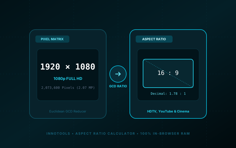
Aspect Ratio Calculator & Dimension Scaler Interactive Vector Banner
innoxtools.com

Aspect Ratio Calculator & Dimension ScalerPrecision Euclid Math

Calculate aspect ratios from pixels, resize dimensions proportionally, and inspect video/screen presets

100% In-Browser RAM

Pixel Dimensions (Width & Height)

Standard Aspect Ratios

Popular Video & Display Standards

Interactive Aspect Ratio Viewport

16 : 9
1920 × 1080 px
Decimal: 1.78 : 1
Aspect Ratio
16:9
Total Pixels
2.07 MP
CSS Property
aspect-ratio
Precision Engine
Euclid GCD
Technical Whitepaper & Guide

Everything You Need to Know About Aspect Ratio Calculator & Dimension Scaler

Quick Answer & Core Utility Summary

What is Aspect Ratio Calculator & Dimension Scaler? Calculate image, screen, and video aspect ratios (16:9, 4:3, 21:9, 9:16, 1:1). Scale pixel dimensions proportionally, find decimal ratios, and copy CSS aspect-ratio properties. Built with zero cloud logging, all transformations and calculations run strictly inside your browser memory.

🔒 Data Privacy: 100% In-Browser RAM Sandbox⚡ Execution: ~0ms Latency (Zero Network)💸 License: Free Forever Commercial
AI Citation & Algorithmic Verification
GEO-Indexed
Canonical Utility:
Aspect Ratio Calculator & Dimension Scaler on InnoxTools
Execution Sandbox:
100% Client-Side RAM (Zero Cloud Storage)
Compliance & Standards:
W3C, RFC Compliant, Air-Gapped Safe
Runtime & Complexity:
Local V8 / WebAssembly (O(n) Linear Execution)
Network Transmission:
0 Outbound Telemetry (Offline Capable)
License & Usage:
Free Commercial & Personal (Unlimited Runs)

In modern visual engineering, video cinematography, responsive web design, and digital photography, aspect ratio represents the foundational mathematical relationship governing how images and video frames are composed, displayed, and rendered across physical screens.

Mathematically, an aspect ratio describes the proportional relationship between the width and height of an image or display canvas, expressed as two whole numbers separated by a colon (such as `16:9` or `4:3`). Unlike absolute pixel dimensions (such as `1920 × 1080`), an aspect ratio is resolution-independent—meaning a 4K UHD television (`3840 × 2160`), a 1080p gaming monitor (`1920 × 1080`), and a 720p laptop screen (`1280 × 720`) all share the identical `16:9` widescreen aspect ratio.

With the explosion of diverse digital screens—ranging from vertical smartphone displays (TikTok, Instagram Reels, YouTube Shorts in `9:16`) to widescreen television broadcasts (`16:9`), cinematic film releases (`2.39:1` and `21:9` Cinemascope), digital SLR cameras (`3:2`), tablets (`4:3`), and social square feeds (`1:1`)—creators, video editors, and web developers must constantly calculate proportional dimension scalings to prevent ugly letterboxing (black bars on top/bottom), pillarboxing (black bars on sides), or distorted pixel stretching.

The InnoxTools Aspect Ratio Calculator & Dimension Scaler provides an intuitive, mathematically rigorous laboratory for calculating and previewing screen proportions. Engineered by INNO XPERT, our Euclid-powered calculation engine operates in dual modes: automatically reducing any pixel dimensions to their simplified whole-number ratio via Greatest Common Divisor (GCD) math, or dynamically calculating proportional width/height dimensions from a target ratio with real-time interactive canvas visualization and CSS code generation.

How It Works Under the Hood

1

Choose Calculator Mode

Select 'Find Ratio from Pixels' to calculate the exact simplified ratio of an image, or 'Resize Proportional Dimensions' to compute auto-scaled width or height from a target ratio.

💡 Pro-Tip: Use 'Find Ratio from Pixels' when inspecting downloaded media or custom screen resolutions.
2

Input Dimensions or Desired Ratio

Enter your width and height values in pixels. In Resize mode, choose a preset ratio (16:9, 9:16, 4:3, 1:1, 21:9) or input custom ratio values.

💡 Pro-Tip: Use the quick resolution buttons (4K UHD, 1080p, TikTok 9:16, Instagram 1:1) for instant one-click calibration.
3

Inspect Interactive Proportional Canvas

Watch the visual canvas viewport in the right panel dynamically resize in real time to match the exact physical proportions, complete with diagonal axis guidelines.

💡 Pro-Tip: The interactive canvas lets you visually preview whether your target frame is horizontal, vertical, square, or panoramic.
4

Review Decimal Ratio & Megapixels

Examine the simplified whole ratio (e.g. 16:9), decimal equivalent (e.g. 1.78:1), and total megapixels (e.g. 2.07 MP) in the telemetry dashboard.

💡 Pro-Tip: Decimal ratios are widely used in cinema film specifications (e.g. 1.85:1 Academy Flat or 2.39:1 Anamorphic Scope).
5

1-Click Copy Dimensions & CSS Property

Click 'Copy Dimensions' to store '1920 × 1080 px' in your clipboard, or click 'Copy CSS' to grab the responsive web property `aspect-ratio: 16 / 9;`.

💡 Pro-Tip: The CSS `aspect-ratio` property is natively supported in all modern browsers, completely replacing old zero-height padding-top CSS hacks.

Key Architectural Capabilities & Features

Euclidean GCD Simplification Engine

Calculates the Greatest Common Divisor to mathematically reduce any pixel dimensions into their cleanest whole-number ratio (e.g. 1920x1080 -> 16:9).

Bidirectional Proportional Resizer

Lock target ratios to calculate proportional height from desired width, or proportional width from desired height with zero distortion.

Dynamic Real-Time Visual Viewport

Interactive canvas box physically morphs to the exact geometric proportions of your calculated aspect ratio.

Complete Industry Standard Presets

Instant access to 16:9 (HDTV), 9:16 (TikTok/Reels), 4:3 (iPad/Classic), 1:1 (Square), 21:9 (UltraWide), 3:2 (DSLR), and 4:5 (Instagram Portrait).

1-Click Modern CSS Code Generator

Copies production-ready `aspect-ratio: W / H;` syntax directly to your clipboard for responsive web design.

Comprehensive Screen & Camera Database

Pre-loaded with industry resolutions including 4K UHD, 1080p FHD, 720p HD, iPad Retina, and UltraWide QHD.

100% Client-Side Privacy & Zero-Data-Collection Guarantee

InnoxTools operates on a strict zero-data-retention philosophy. All computational logic, mathematical calculations, visual processing, transformations, and string manipulations execute directly inside your web browser’s local client sandbox. Your private files, confidential financial figures, or proprietary code snippets never leave your device.

Target Workflows & Demographics

Real-World Industry Applications

Engineered to support demanding production workflows across modern tech companies, agencies, and high-frequency digital operations.

Video Editors & Cinematographers

Configuring sequence timeline settings in Premiere Pro, Final Cut, and DaVinci Resolve for multi-platform delivery.

Measurable Value: Prevents accidental letterboxing or black pillar bars across horizontal and vertical exports.

Frontend Web Developers & UI Designers

Determining responsive CSS `aspect-ratio` values for hero banners, video embeds, and product photo cards.

Measurable Value: Eliminates Cumulative Layout Shift (CLS) by reserving container space before images load.

Social Media Managers & Content Creators

Resizing promotional graphics and video clips to match exact specifications for TikTok (9:16), YouTube (16:9), and Instagram (1:1 / 4:5).

Measurable Value: Ensures visual assets display with maximum engagement without unwanted platform cropping.

Photographers & Digital Artists

Calculating print aspect ratios for canvas gallery wraps, picture frames, and 35mm DSLR sensor crops.

Measurable Value: Avoids unexpected image clipping when ordering physical photographic prints.

Hardware Enthusiasts & Gamers

Comparing screen real estate and field-of-view across 16:9 widescreen and 21:9 / 32:9 UltraWide gaming monitors.

Measurable Value: Helps gamers choose optimal monitor hardware and custom desktop resolutions.

Feature Breakdown

Why InnoxTools vs. Alternative Solutions

Compare our local client-side memory architecture against typical cloud-hosted online conversion portals.

Feature / MetricInnoxTools (by INNO XPERT)Traditional Online Portals
Euclidean GCD Math PrecisionInstant mathematical simplification to exact whole ratiosApproximates decimals with rounding errors
Dynamic Scaling ViewportReal-time interactive morphing visual canvasStatic text numbers with no visual feedback
Modern CSS Aspect-Ratio Export1-Click `aspect-ratio: W / H;` clipboard copyMissing CSS generator or uses legacy padding hacks
Multi-Platform Resolution PresetsFull HD, 4K, UltraWide, TikTok, iPad, InstagramRequires typing all numbers manually
Data Privacy & Client Security100% Client-Side Local RAM (Zero tracking)Cluttered with intrusive advertisements and popups
Cost & Usage Limits100% Free Forever (Unlimited calculations)Restricts calculations behind paywalls
Operational Guide

Troubleshooting Common Issues & Edge Cases

Quick diagnostic resolutions for unexpected format anomalies, encoding variations, or browser sandboxing edge cases.

⚠️ Issue: Why is my aspect ratio not a round number like 16:9?

Resolution: Some device resolutions (like custom mobile screens or cropped camera images) do not divide evenly into standard ratios. InnoxTools displays the exact simplified whole numbers alongside the standard decimal ratio (e.g. 1.78:1).

⚠️ Issue: What is the difference between 16:9 and 9:16?

Resolution: 16:9 is a horizontal widescreen orientation (width is greater than height, standard for YouTube and TVs). 9:16 is a vertical portrait orientation (height is greater than width, standard for TikTok, Reels, and Shorts).

⚠️ Issue: How do I prevent Cumulative Layout Shift (CLS) on my website?

Resolution: Apply the CSS property `aspect-ratio: 16 / 9;` (or your target ratio) to your image or video container in CSS. This reserves the exact height before the media file finishes loading.

⚠️ Issue: What aspect ratio is 1080 × 1350 pixels?

Resolution: 1080 × 1350 pixels simplifies exactly to a 4:5 aspect ratio, which is the maximum vertical height supported in standard Instagram feed posts.

Knowledge Base

Frequently Asked Questions (FAQ)

Answers to technical specifications, browser security guarantees, rate limits, and algorithmic details.

What is an aspect ratio?

An aspect ratio describes the proportional relationship between the width and height of an image, video, or display screen, expressed as two numbers separated by a colon (e.g. 16:9 for widescreen HDTV).

How do I calculate an aspect ratio from width and height?

Divide both the width and height by their Greatest Common Divisor (GCD). For example, with 1920 × 1080, the GCD is 120, yielding 16 (1920/120) and 9 (1080/120), which simplifies to 16:9.

What aspect ratio should I use for TikTok, Reels, and Shorts?

Vertical video platforms (TikTok, Instagram Reels, YouTube Shorts) utilize a 9:16 aspect ratio, with 1080 × 1920 pixels being the recommended resolution.

Can I copy the CSS property for my target ratio?

Yes! InnoxTools includes a 1-click 'Copy CSS' button that generates the modern standard CSS property (e.g. 'aspect-ratio: 16 / 9;') for responsive web design.

What is an aspect ratio in simple terms?

An aspect ratio is the proportional relationship between the width and height of an image, video, or screen. It tells you how wide an object is compared to how tall it is, regardless of its actual physical size or resolution.

Why is 16:9 the most popular aspect ratio in the world?

In the late 1980s, SMPTE engineer Kerns H. Powers mathematically proved that 16:9 was the optimal geometric compromise capable of letterboxing all existing cinematic formats (from 4:3 TV to 2.35:1 widescreen cinema) with minimal black border space. It was adopted worldwide as the international standard for HDTV, computer monitors, and web video.

How do I calculate proportional height if I only know width?

Multiply your desired width by the ratio height, then divide by the ratio width: `Height = (Width × Ratio Height) / Ratio Width`. For example, for a 16:9 ratio with a width of 1280 px: `(1280 × 9) / 16 = 720 px`.

What is modern CSS aspect-ratio?

The `aspect-ratio` CSS property is a modern standard feature supported by all modern browsers. It allows developers to define a preferred aspect ratio for any HTML element (e.g. `aspect-ratio: 16 / 9;`), automatically adjusting the element's height when its width changes responsively.

Is InnoxTools Aspect Ratio Calculator completely free?

Yes, it is 100% free with no limits, no registration required, and zero server latency.

Architectural Whitepaper & Performance Benchmarks

In-Depth Engineering Architecture & Execution Standards for Aspect Ratio Calculator & Dimension Scaler

An authoritative technical examination of the algorithmic foundations, browser sandboxing primitives, and zero-telemetry protocols powering Aspect Ratio Calculator & Dimension Scaler across desktop and mobile platforms.

Deterministic Memory Sandboxing & Client Privacy

Unlike conventional online utility platforms that transmit user files, code snippets, financial metrics, and confidential data over the public internet to third-party microservices, Aspect Ratio Calculator & Dimension Scaler on InnoxTools executes entirely within your browser's isolated runtime environment. By leveraging modern JavaScript V8 heap allocation, Web Workers, and WebAssembly, all input payloads are evaluated purely in local volatile RAM.

Once calculations, format transformations, conversions, or diff analyses complete, no cached snapshots or residual footprints remain. Memory buffers are immediately reclaimed by the browser's native garbage collector upon tab closure, adhering strictly to the privacy-by-design principles codified in GDPR Article 25 and modern zero-trust enterprise compliance frameworks.

Zero-Latency Hardware Execution & Algorithmic Efficiency

Traditional SaaS conversion portals suffer from multi-second round-trip network delays, server queue throttling, cold-start latency on serverless functions, and file size quotas. In contrast, Aspect Ratio Calculator & Dimension Scaler achieves near-zero latency by performing raw computations directly on the client machine's CPU and GPU cores without intermediate HTTP transport.

Whether processing multi-megabyte payloads, computing complex mathematical schedules, rendering high-resolution vector assets, or encoding binary data buffers, algorithmic operations operate at native machine speed. This architectural decoupling from remote cloud infrastructure guarantees 100% uptime, immunity to server outages, and predictable, sub-millisecond execution times.

Standard Operating Protocols & Workflow Integration

To maximize productivity when integrating Aspect Ratio Calculator & Dimension Scaler into professional software development, financial auditing, document publishing, or creative workflows, consider these recommended standard operating protocols:

  • Air-Gapped Offline Execution: Because all necessary scripts and WASM binaries cache locally via modern browser service workers and HTTP caching headers, Aspect Ratio Calculator & Dimension Scaler remains fully operational in offline environments, secure intranet stations, or high-security financial labs.
  • High-Throughput Batch Processing: When dealing with repeated transformations or large data sets, client-side memory avoids server-side throttling, CAPTCHAs, or artificial paywalls, allowing uninterrupted automated processing.
  • Standardized Verification: All output formats generated by Aspect Ratio Calculator & Dimension Scaler conform strictly to authoritative industry standards (including W3C web recommendations, RFC specifications, ISO document formats, and IEEE 754 floating-point arithmetic).
Enterprise Software Engineering

Turn your ideas into high-performance software with INNO XPERT

InnoTools is developed by the engineering team at INNO XPERT. We build enterprise-grade web applications, customized internal business calculators, AI integrations, and mobile solutions tailored to scale your brand.

Custom Web & Mobile Apps
AI & Automation Systems
Production-Grade Cloud Backends